Douglas Elliman - Branding
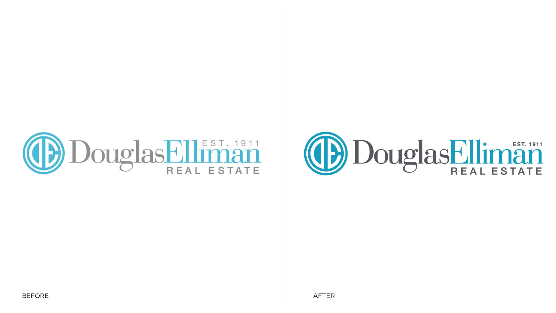
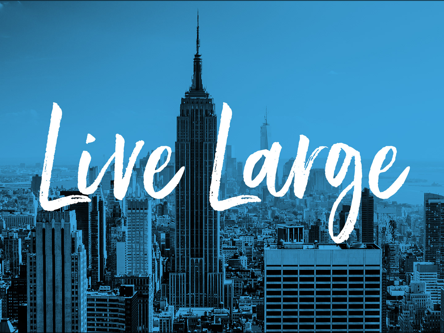
Douglas Elliman is a premier high-end real estate company based in New York, who wanted to bring its regional brand to the national stage. In addition, they wanted to refresh their brand while maintaining their highly regarded brand recognition.
Jessica's Role - Rework Typography and Environmental Signage
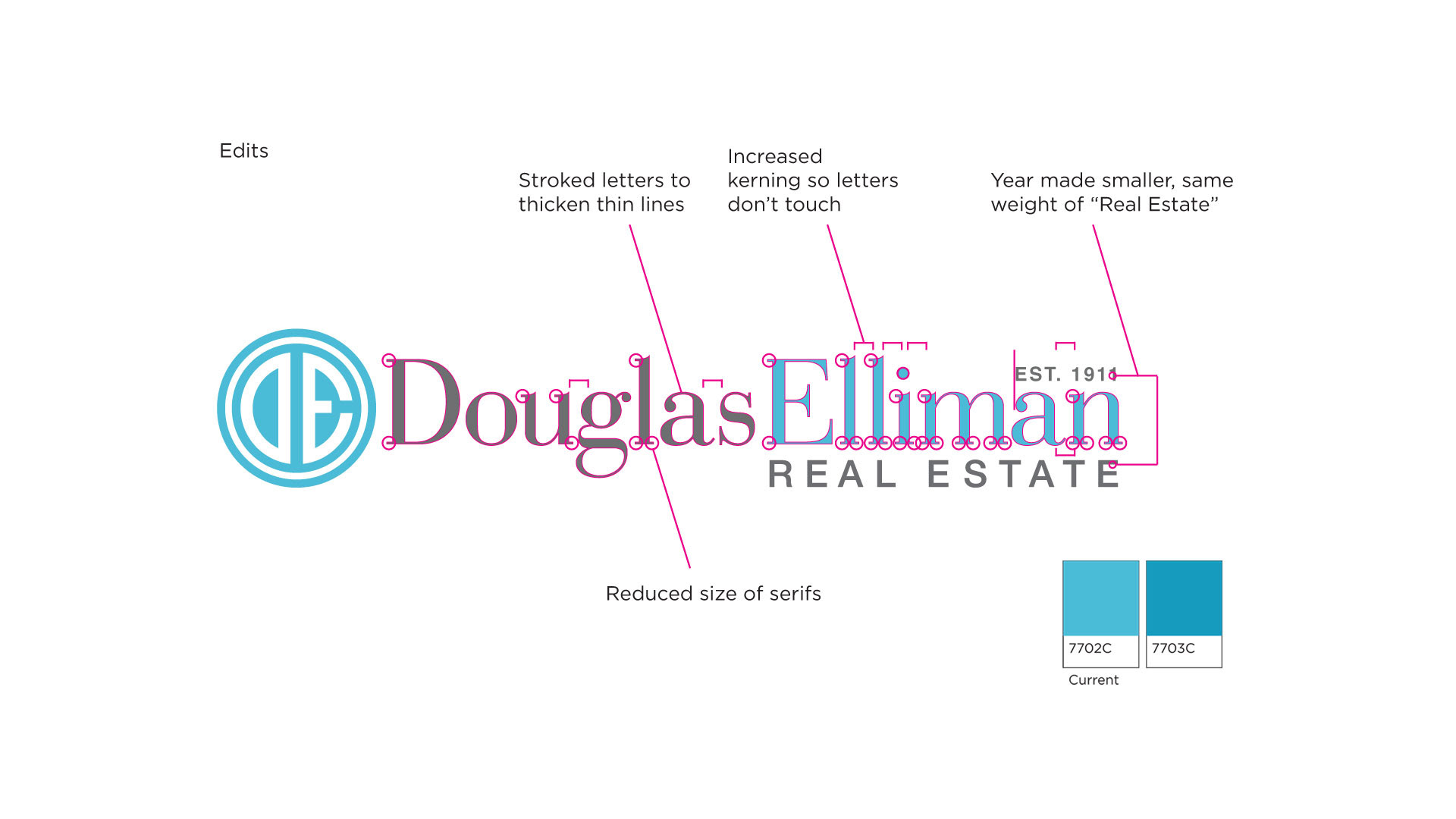
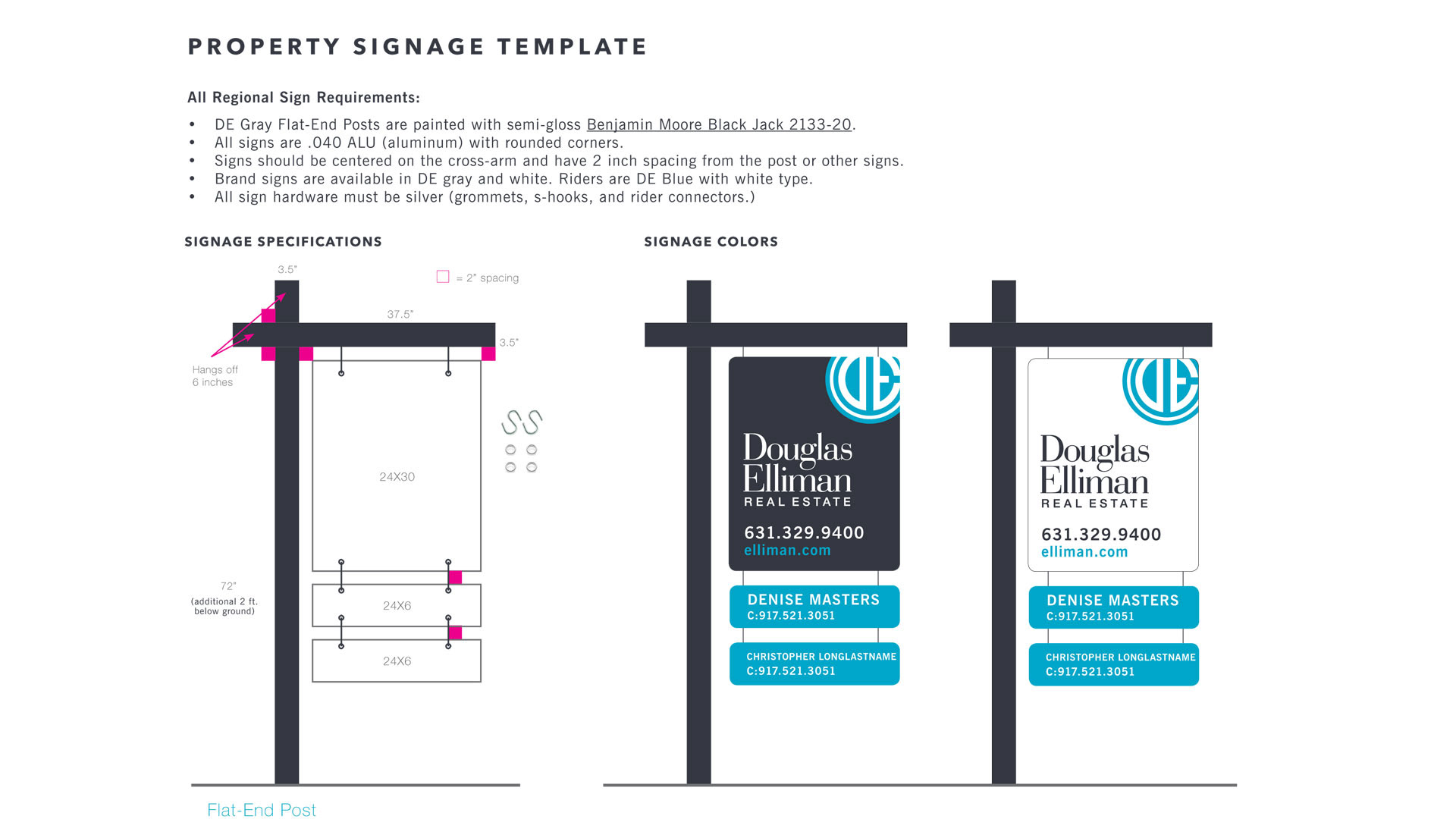
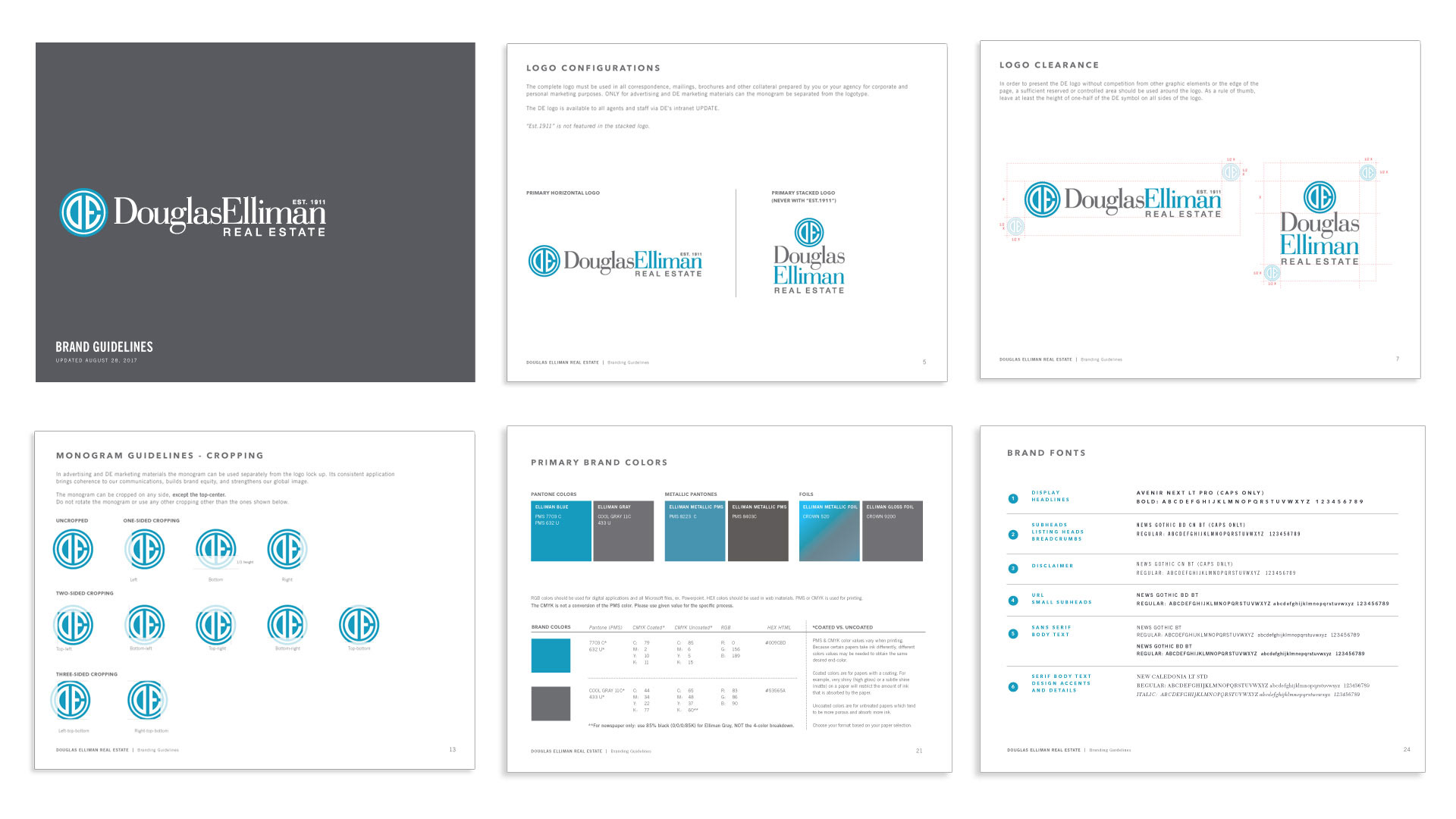
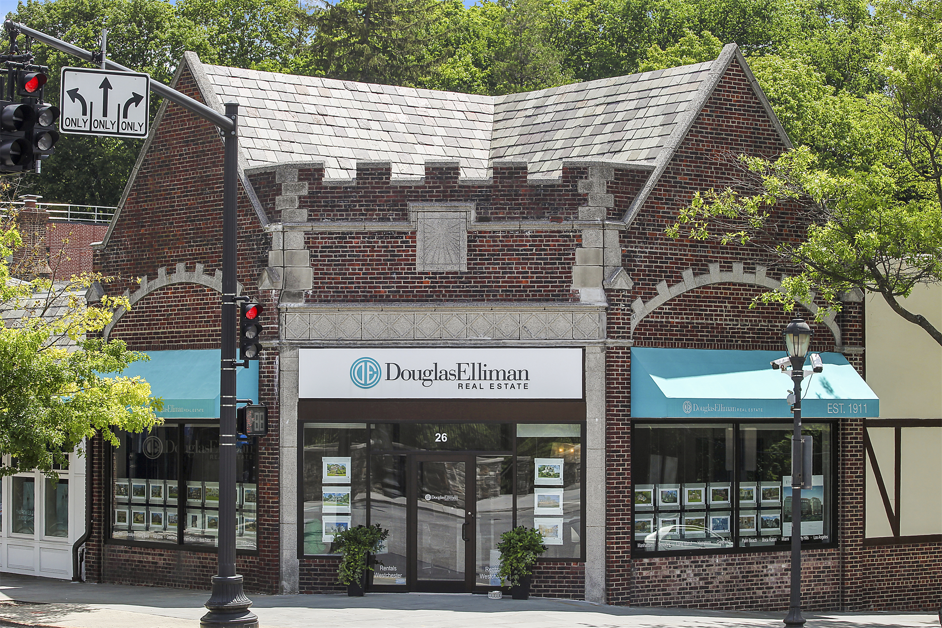
Jessica worked to elevate the brand by rethinking the visual identity, logo mark, and color palette. Jessica focused on reworking the letterforms to give the logotype a facelift. She also reinvented the ever so important property sales signage. To differentiate between its competitors, Jessica decided to darken the sales sign from the standard white to a dark gray. This was so successful it lead the whole NYC real estate industry into a VI revamp.
Project Scope
Logo Design / Brand Guidelines / Signage / Collateral Design
Credits
Team: AgencySacks